.

.
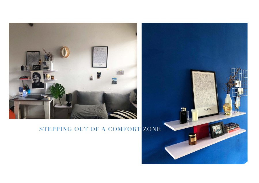
There was one colour popped out in my mind when I was about to repaint my room. It is one of my comfort colours after black and white; dark grey. I always find it classy and soothing. But I changed my mind.
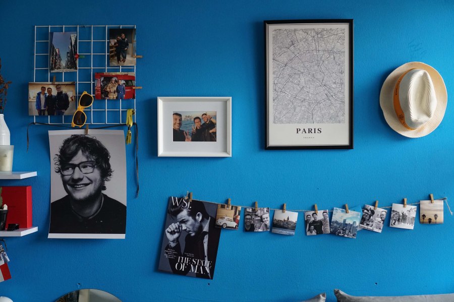
Dark blue came as an option and ended with a colour accident. I got the blue (well, I didn’t go to get the paint. I wish I could that day), the blue was okay, it was quite dark but bright enough for a room. I worried if it was too dark it wouldn’t bring a good mood in the morning when the sunshine falls on it.
I always found the white before was great cause it was easy on the eye, versatile, and clean. Okay, the day to apply the blue I had to face one issue: it was not enough for one wall. I just wanted only one wall and the rest would be repainted on white. Long story short, I got somebody to get one more tin with the wrong blue which was ridiculous (he didn’t even bring the code to the store, Lord). I sent him again and got the same blue. Walla ;), the same blue looked different when I was applying on the first blue. Another issue. Problem solved by quick thinking: I mixed the wrong + the right blue and ended looking like the blue on Ed Sheeran’s Divide Album cover.
I found it was such a step from my comfort colour. It doesn’t look bad, does it?

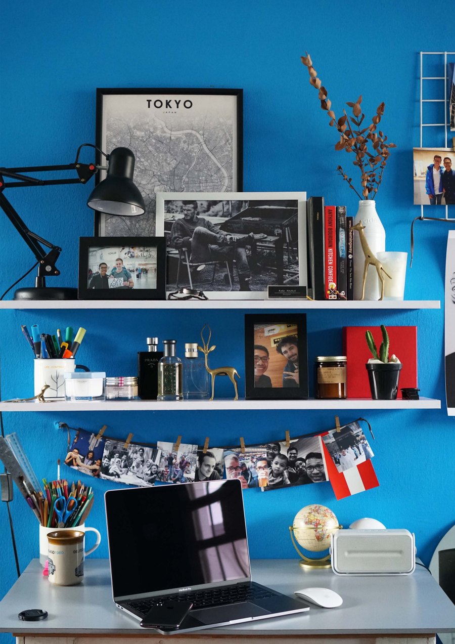
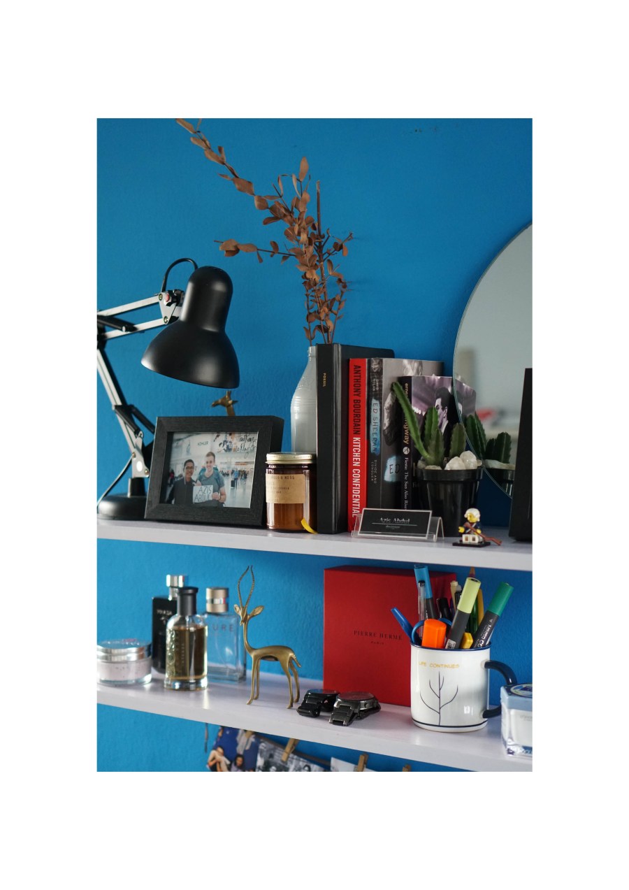
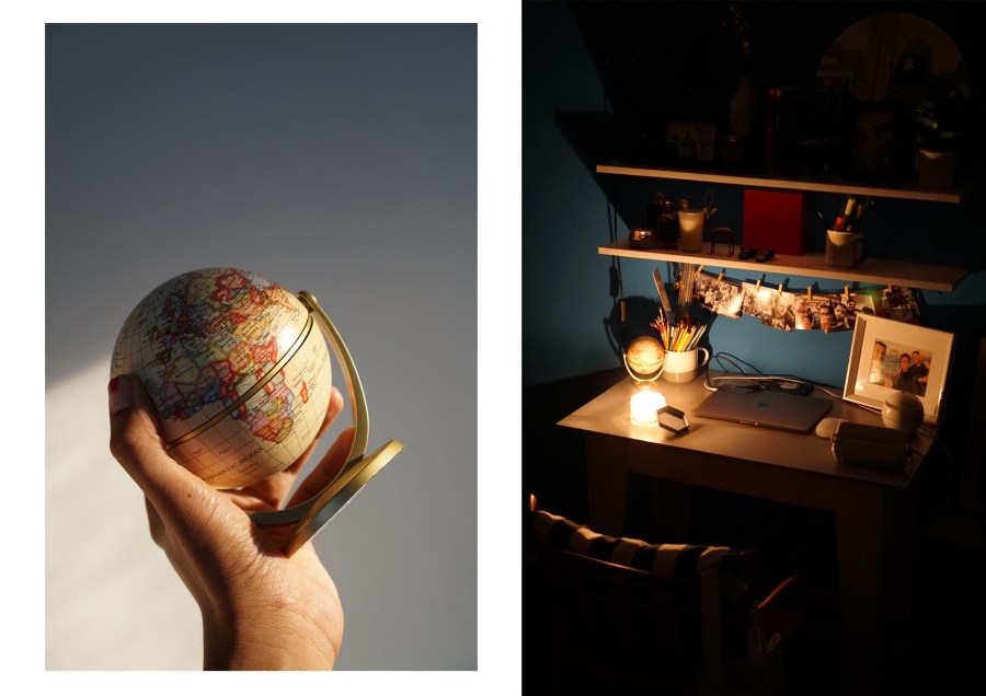
I have two things to do every Sunday morning for this room: cleaning is compulsory, rearranging those things every week refreshes the look.
.